
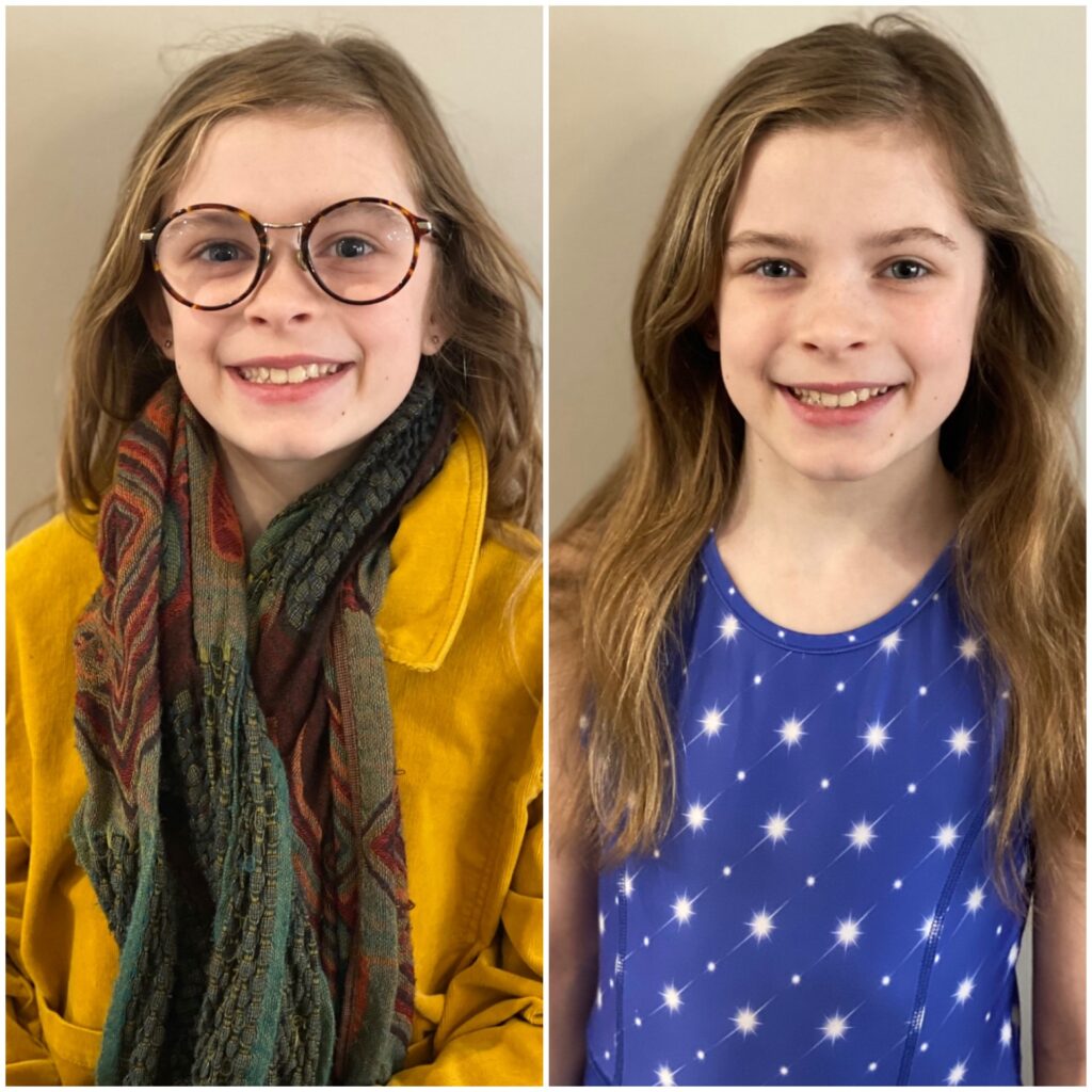
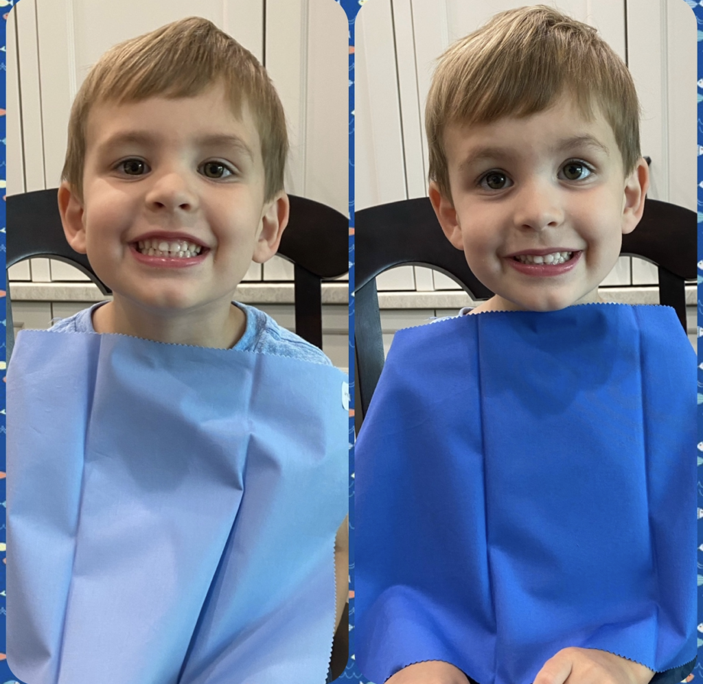
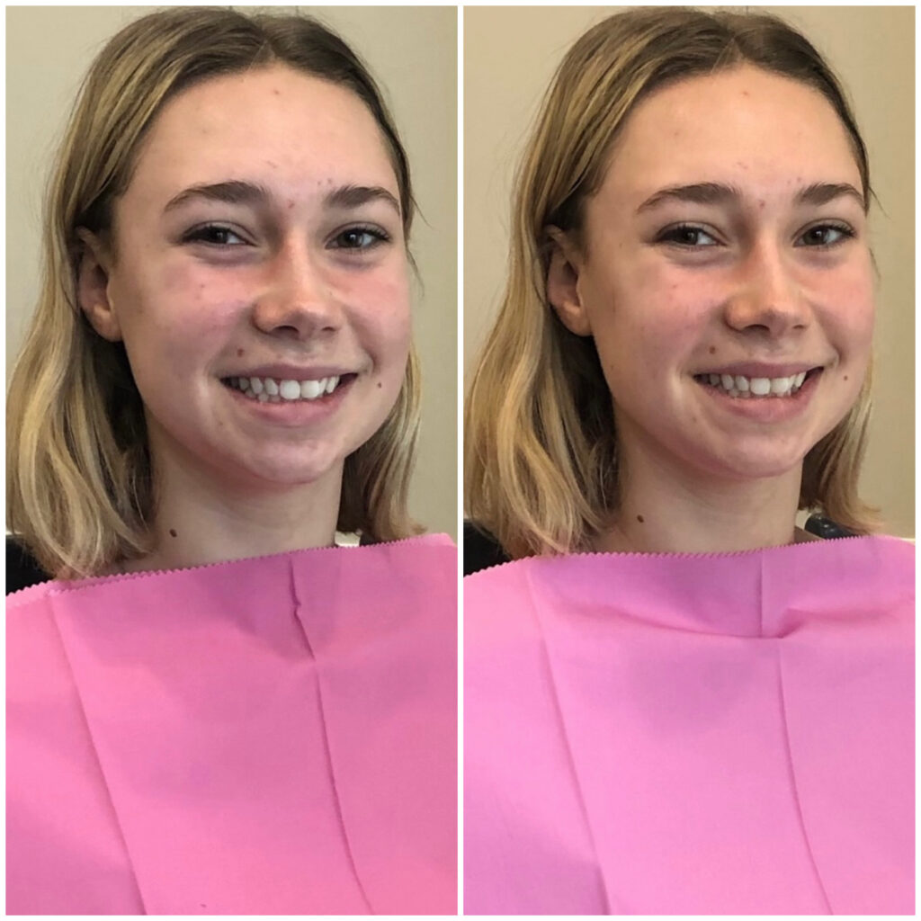
Below are examples of how the right color choices bring out your natural best.
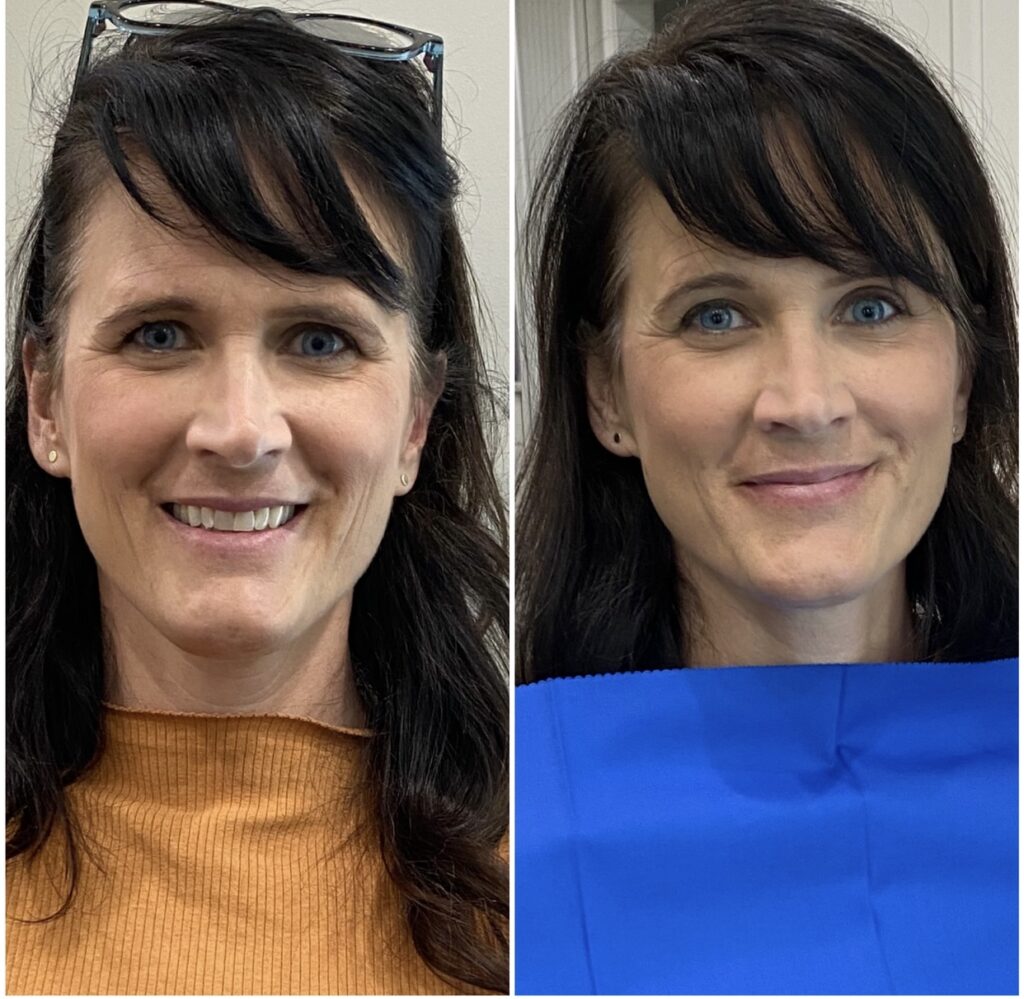
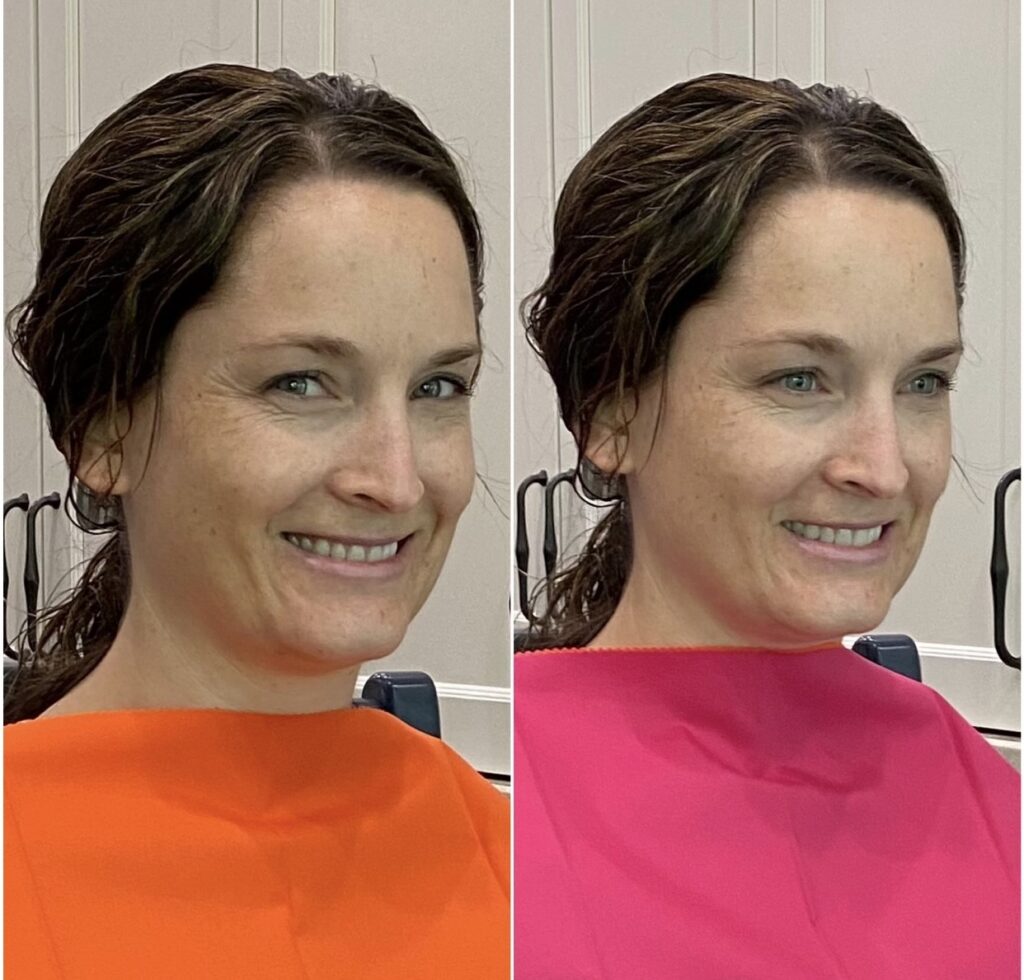
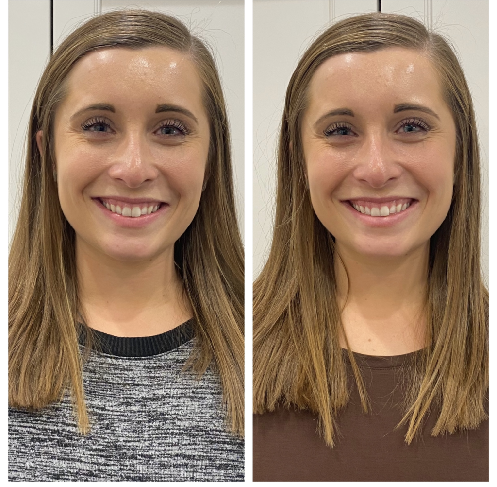
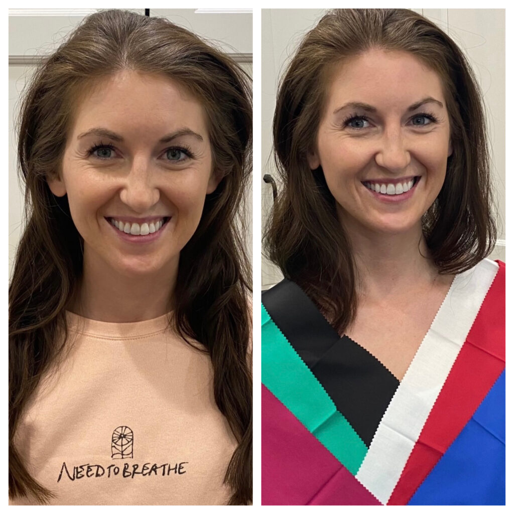
Laura: Cool Coloring in Action
In both images below, the lighting and background are identical — but the effect is very different. In the image on the right, you’ll see how the perfect color + contrast lets Laura’s natural sparkle shine through.
Why the Right Color Matters
- Harmony, not distraction. The best color supports and enhances your natural features.
- From first glance to second look. Great color builds a flow that invites deeper attention.
- You should own your look. The ideal tones help you embody — not be overshadowed by — the color.
Below, each pair shows the recommended look on the right. Do you see the difference?
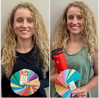
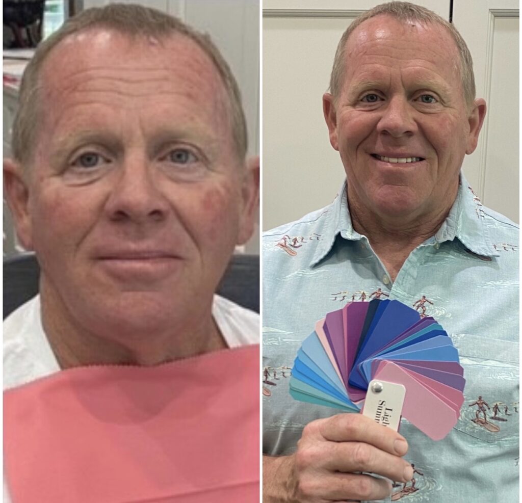

Notice how in the less-than-ideal choice (left), your eyes first see the color… then the face. But in the ideal image (right), your gaze flows naturally from hair to eyes to skin, and the person wears the color — not the other way around.
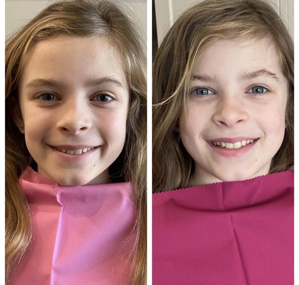
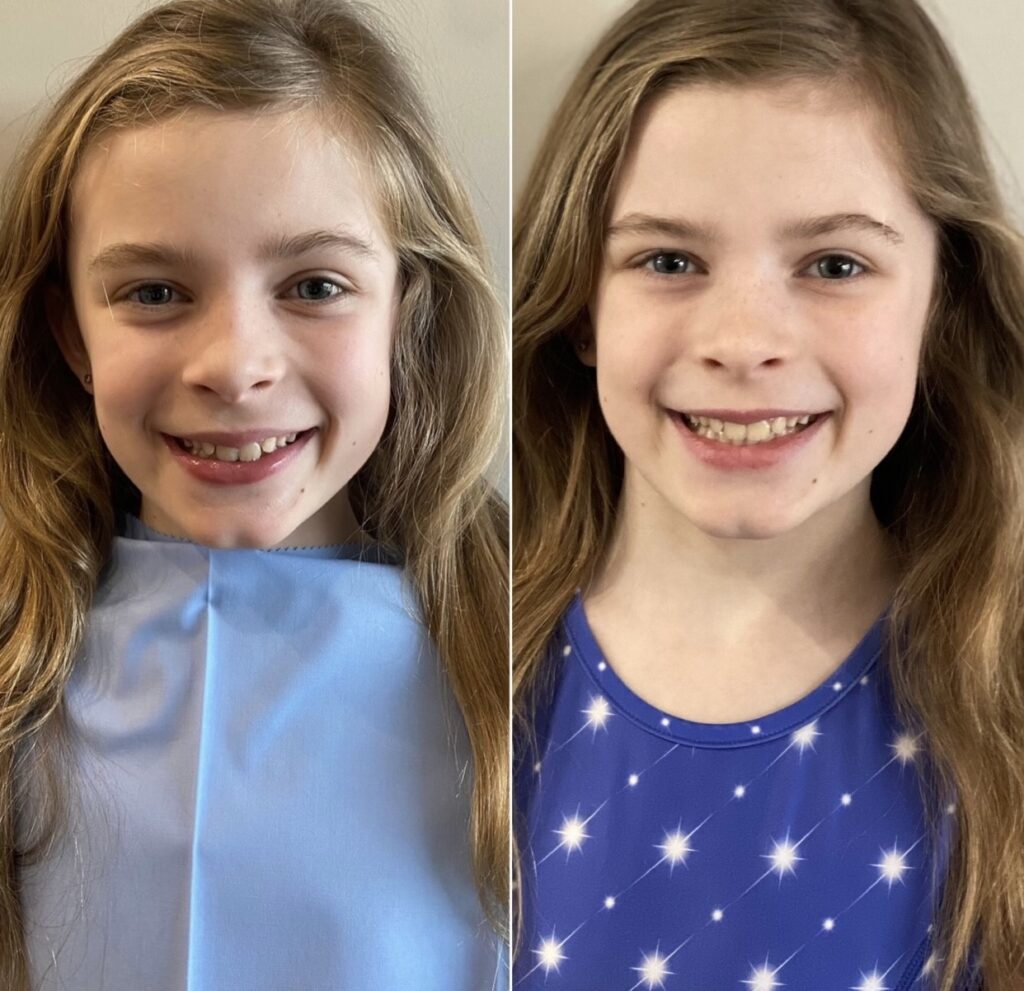
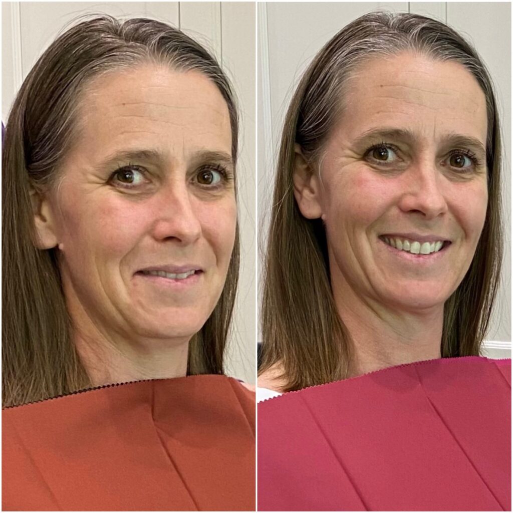
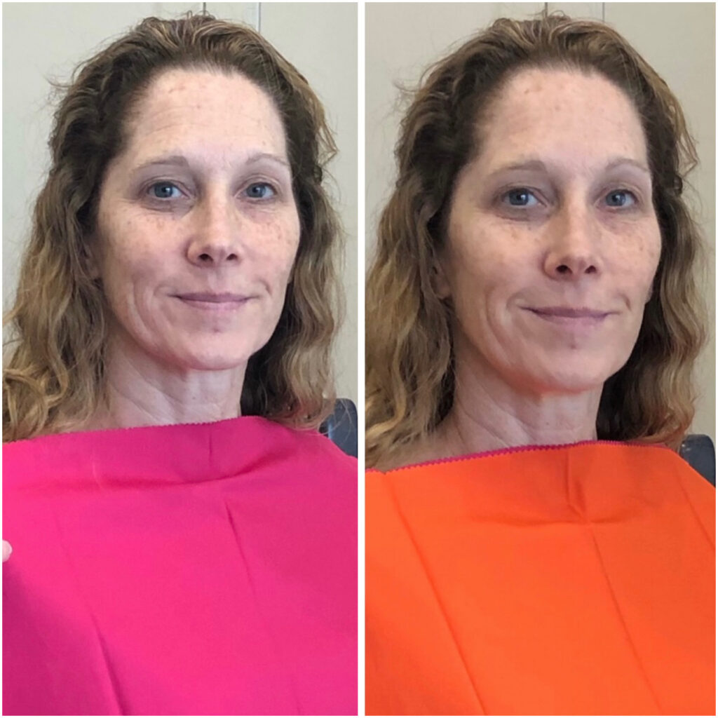

If you’re struggling to see the difference, step back 5–6 feet — the contrast is more obvious from afar. And if you still aren’t sure, reach out. I’ll walk you through it.